Misleading Analysis in Finance
The Problem with Analytical Trickery
Twitter is full of interesting pieces of financial research. People post all kinds of charts showing indicators, economic metrics, and statistics. While clearly most of this analysis should not be used immediately as a trading signals, it can help to sharpen one’s understanding of why certain movements in markets occur.
However, some analysis is misleading, and that is what we will address in this post. We’re not talking about technical analysis. While price charts with manually annotated support lines, shoulders and heads might also be misleading for people new to trading (think of all the courses that advertise how to day trade [and make $5k per day]), the uncertainty is generally not hidden: Prices might go down (break the support) or it might go up (hold the support).
What we mostly have an issue with is analysis that tailors historical data in such a way that it makes definitive claims about how things ought to work. This distracts and can lead to poor decision making.
#1 Period Overlaps
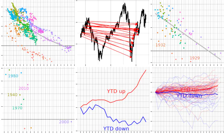
The Shiller P/E ratio (also called the CAPE, cyclically adjusted price-to-earnings) is a valuation measure that compares the current price of a stock or index to its average earnings adjusted for inflation. If the Shiller P/E ratio is high, it may indicate that the price is overvalued, while a low Shiller P/E ratio may indicate that it is undervalued.
The Shiller P/E ratio is primarily a long-term indicator. It can suggest that current prices are overly high (or low) and that a correction may be imminent. However, it may take longer than some investors would like for the correction to occur. The saying goes that the market can remain irrational for longer than some investors can remain financially solvent.
This is why the Shiller P/E ratio is often analyzed over a 10-year period, during which the metric has historically tended to normalize. In the past, low P/E ratios have been followed by high returns, while high P/E ratios have been followed by low (or negative) returns.
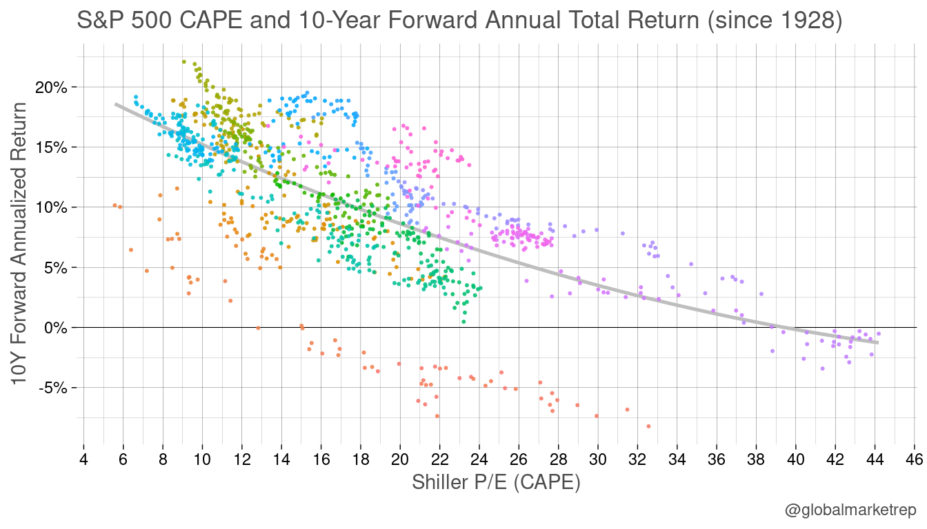
The chart above shows a clear negative correlation. In the history of the US stock market, high CAPE ratios above 40 have never been followed by positive returns, and low CAPE ratios below 15 have never been followed by negative returns. Charts like this are often annotated with the R-square score of a linear model. The R-square measures how much of the variance of the observations is captured by the fit (we did not put this caption in the chart).
The problem is that the dots represent monthly data, which means that there is significant overlap between the 10-year forward return periods. Also the series of CAPE is of course highly auto-correlated (i.e. there are no abrupt changes). In fact, in the chart above, all of the dots with a CAPE over 40 are from 1999 and 2000, so the return is for the period between 1999 and 2010. This was the most unprofitable period to have been invested in as it ended during the maximum drawdown of the Financial Crisis crash.
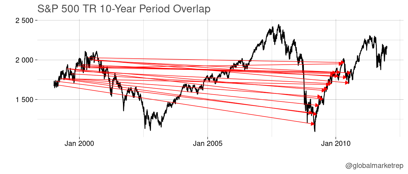
Even two observations separated by one year will have 90% overlap in the forward return (the same return data for 9 out of 10 years).
What’s the solution? Avoid data overlaps! However, this will decrease the number of observations, which can make the scatterplot less impressive.
In the following plot, we reduced the number of CAPE observations to just January of each year since 1928. This means that the overlapping issue persists. For example, 2000 and 1999 (both with a CAPE over 40) have an overlap of the forward return of 9 out of 10 years.
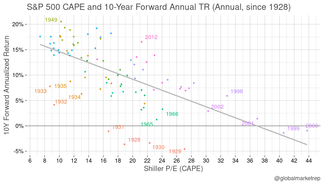
To truly avoid overlap while still examining 10-year return periods, we could only use one observation per decade.
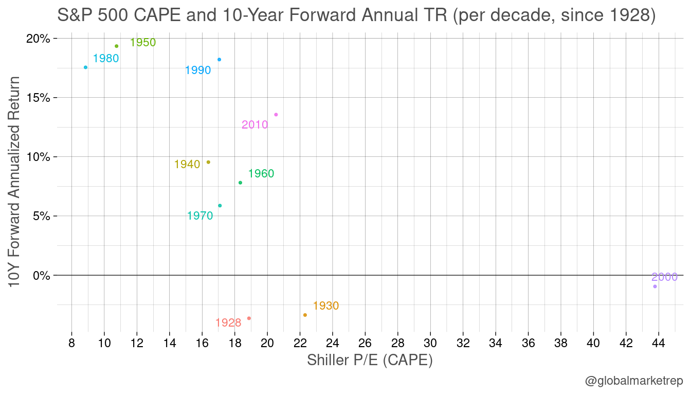
Although we can see 2000 with a CAPE of nearly 44 on the bottom right and 1980 and 1950 on the top left, the area between CAPE 15 and 24 is not entirely clear.
We do not think that the CAPE is incorrect. It makes perfect sense that low valuations are followed by an increase in prices and that high valuations might be exaggerated and result in price reversals. However, the picture is less clear than suggested when using overlapping periods.
#2 Returns Averaging
This type of analysis may have originated from event studies, such as earnings releases. It is often observed that stocks of companies whose earnings beat the consensus estimate tend to rise for several days after the release, while those that disappoint tend to fall for several days.
Of course, this is not true for all companies or all earnings releases, but it is a general tendency. It is only when the data is averaged that the trend becomes apparent. Therefore, charts showing the averaged cumulative return are often used.
This started to be used for all kind analysis like the one that follows. What’s the return to expect in December given that the YTD stocks have been trading lower or higher? Here’s the chart:
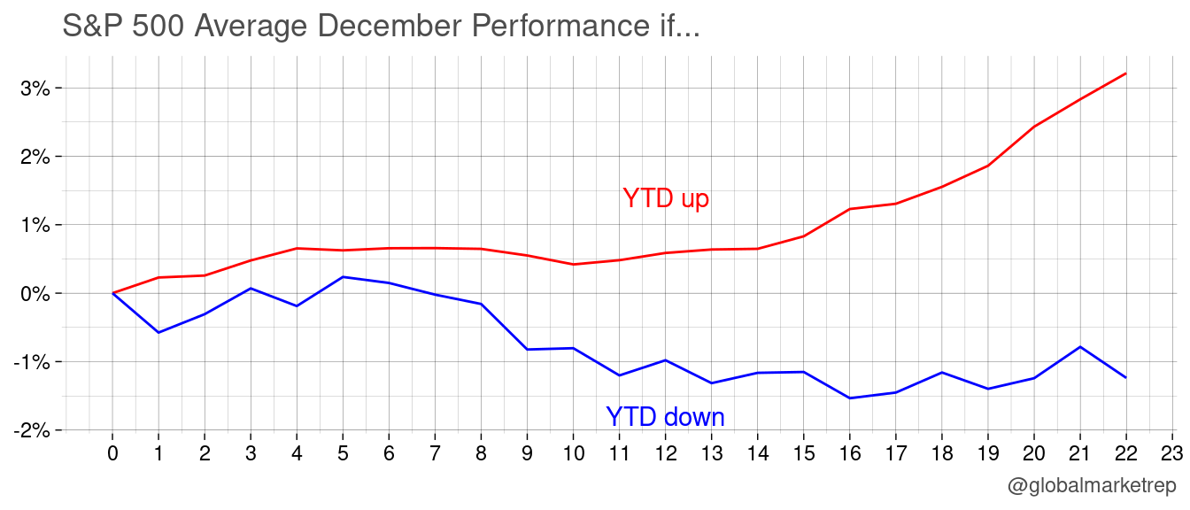
The issue with this should become apparent in the following chart.
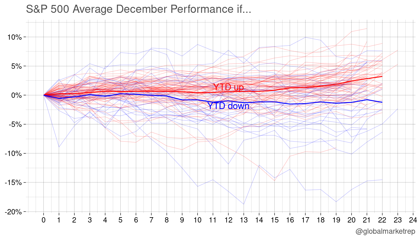
The paths are all over the place, seemingly random. However, on average, it is true that the performance of the S&P 500 index in December amplifies the return of November’s year-to-date return. But the average does not matter to an individual investor, as they are looking at a single year.
So is the observation random? To answer this, we can do a t-test (Welch two sample) to determine whether there is a significant difference between the means of two groups (YTD up or down). We do indeed find a significant difference (p=0.013), which means that December returns are significantly higher (or lower) if YTD has already been up (or down).
However, it is important to remember that this pattern may not appear in a single year.
#3 Random Patterns
It is possible to make any chart show what you want it to show by manipulating the data or the way that it is presented. Commonly one heavily plays with the y-axis scaling (e.g. adding a secondary axis) to overlay two charts that at the end make it look like one of data series explains the path of the other.
Hilarious 👇😊 ht @NautilusCap pic.twitter.com/4gtQFnVTUg
— Michael A. Arouet (@MichaelAArouet) January 8, 2023
Play with axes, data format, and lead/lag, you can make any chart show what you want it to show. Be this world average temperature and stock market performance or the number of storks in observed and the birth rate.
Martin
Trying to make sense of economics and finance. Trading strategies, quant, risk-on/off, macro, global view.