What Quantitative Indicators Predict for 2023
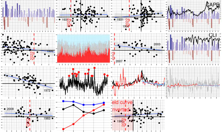
Factors Influencing Market Movements
The stock and bond markets have experienced significant turbulence this year, with the US stock market being down 20%. Various factors played a role, including economic uncertainty, shifts in market sentiment, and the impact of global events.
The concept of a “random walk” refers to the idea that the movement of financial asset prices is unpredictable. This means that it is impossible to predict what will happen in the future. Market movements cannot be accurately forecasted and past performance is not indicative of future results.
Markets can be influenced by a wide range of factors, including both unforeseen events and more predictable economic regimes. On the one hand, unforeseeable events such as wars, and natural disasters can have a significant impact on markets. These types of events can create uncertainty and disrupt market movements in unpredictable ways. On the other hand, certain economic regimes, such as low or high interest rates, inflation, and economic uncertainty, can also facilitate more pronounced up or down movements in markets. For example, low interest rates can stimulate economic activity and lead to rising asset prices, while high interest rates can have the opposite effect. Inflation can also impact market movements, as it can erode the purchasing power of money and affect the value of financial assets.
Despite the limited forecastability, it can be interesting to examine historical data to see how different indicators have been correlated with future stock performance. Examining historical data can provide some useful insights into how different conditions may impact market.
Past Year Performance
Some have argued that stocks that performed well in the past are more likely to continue to do so in the future, a concept known as momentum. The same may apply to the broad stock market, meaning that the direction of returns in a given period is likely to be the same as the direction of returns in the previous period.
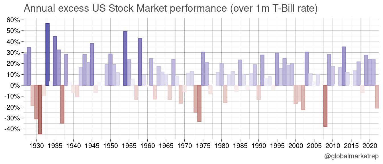
One can observe that down-years tend to occur consecutively, with several examples from history where bear markets have lasted for multiple years. For example, the stock market experienced significant declines from 1929 to 1932 during the Great Depression, in 1940 and in 1941 during World War II, in 1973 and in 1974 during the oil crisis, and from 2000 to 2002 during the dot-com bubble.
Similarly, it is also common for positive years in the stock market to be followed by another up year, sometimes referred to as “persistence”.
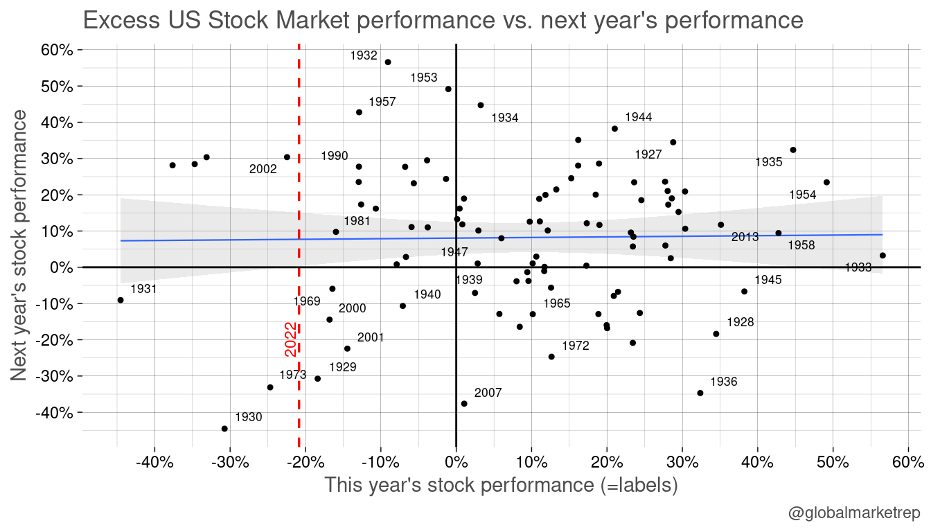
Despite there being a seemingly positive correlation, that is up (down) years tend to be followed by another up (down) year, the relationship is not particularly strong.
In fact, the the weak form of the efficient market hypothesis, developed by economist Eugene Fama in the 1960s, suggests that it is impossible that past price and volume data are not useful for predicting future returns in the stock market.
December Performance
Some studies have found that the so-called “Santa Claus rally,” which refers to the tendency for stocks to perform well in the last few trading days of December, may be related to an increase in buying activity due to the end-of-year holiday season. A stronger demand for stocks during the end of the year might indicate optimism for the year to come.
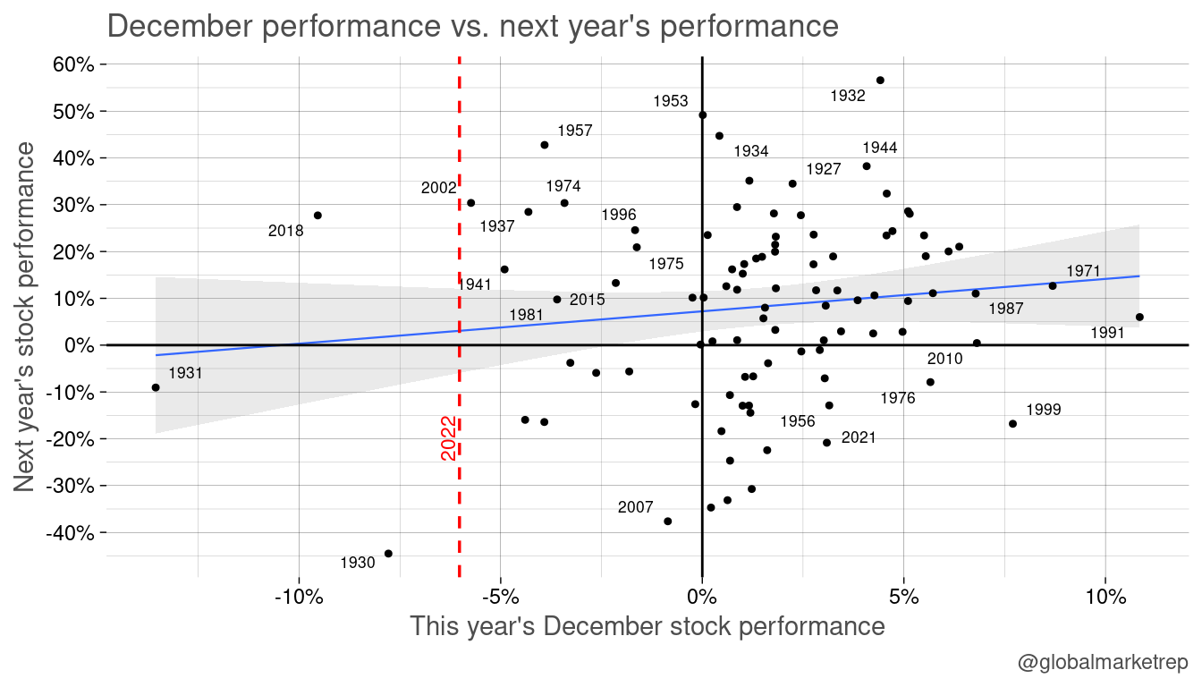
The above scatterplot suggests that the relationship between December stock performance and the following year’s stock performance may be slightly stronger than the relationship between full year performance and the following year’s performance. This means that a good December may be more likely to be followed by a good year for equities, although it is important to note that this relationship is not always present.
In fact, there have been instances, such as in 2002 and 2018, where particularly poor December performance was followed by strong performance in the following year. Again, this highlights the fact that the stock market is subject to a significant degree of randomness.
Shiller PE
One concept that is often mentioned when forecasting stock returns over the medium to long term is the Shiller price-to-earnings ratio (also known as the cyclically adjusted price-to-earnings ratio or CAPE). This ratio, developed by economist Robert Shiller, suggests that long-term stock market returns are related to the level of the Shiller PE at a given point in time. According to the theory, when the Shiller PE is high, future returns are likely to be lower, while lower levels of the Shiller PE are associated with higher future returns. Data on the Shiller PE can be found on a variety of financial websites.
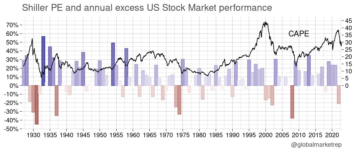
While Robert Shiller’s research has found a clear pattern over the long term that higher levels of the PE ratio are associated with lower future returns and vice versa, the relationship over shorter time horizons such as one year is less clear. This is because market trends, such as bubbles, can continue to grow and drive up the metric. Betting against the trend will then be difficult and timing a market crash is even harder.
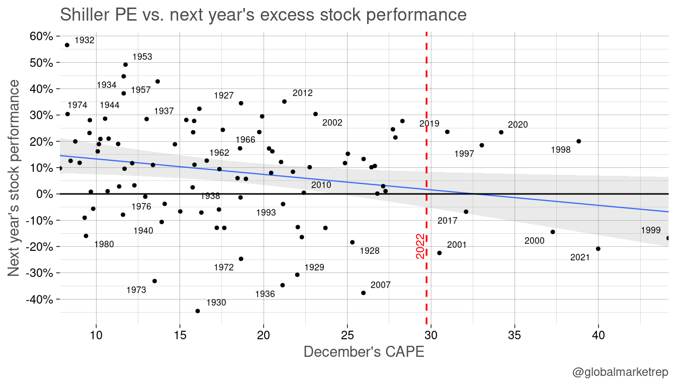
The ratio has declined quite a bit from its recent high of around 40 times earnings to its current level of around 30. This is still above the long-term average of 18.7 (since 1927).
Investor Sentiment
Investor sentiment refers to the overall attitude of investors towards the market and can have a significant impact on movements in valuations. When sentiment is positive, market participants are more likely to buy stocks, which should drive up prices. On the other hand, when investor sentiment is negative, one may be more likely to sell stocks.
The AAII survey, also known as the American Association of Individual Investors (AAII) Sentiment Survey, is a weekly survey of individual investor sentiment towards the stock market. The survey asks institutional investors about their current views on the market and their expectations for future market performance. The results of the survey are reported as the percentage of investors who are bullish (optimistic about future market performance), bearish (pessimistic about future market performance), or neutral (neither optimistic nor pessimistic).
In 2022, the percentage of bullish sentiment among individual investors, as measured by the AAII sentiment survey, has been lower than at any point in the history of the survey.
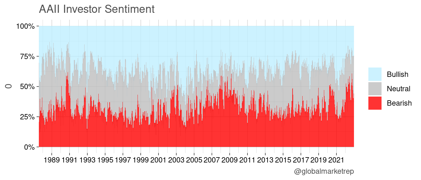
The AAII survey is often used as a tool for gauging investor sentiment and can be helpful for investors looking to get a sense of the overall mood of the market. When bearish sentiment prevails, investors may use this information as a signal to reduce risk-taking. However, some smart investors use the results as a contrarian indicator going against the sentiment of the majority of investors. In the past, many periods of high bearish sentiment have been associated with relatively strong future returns in the stock market.
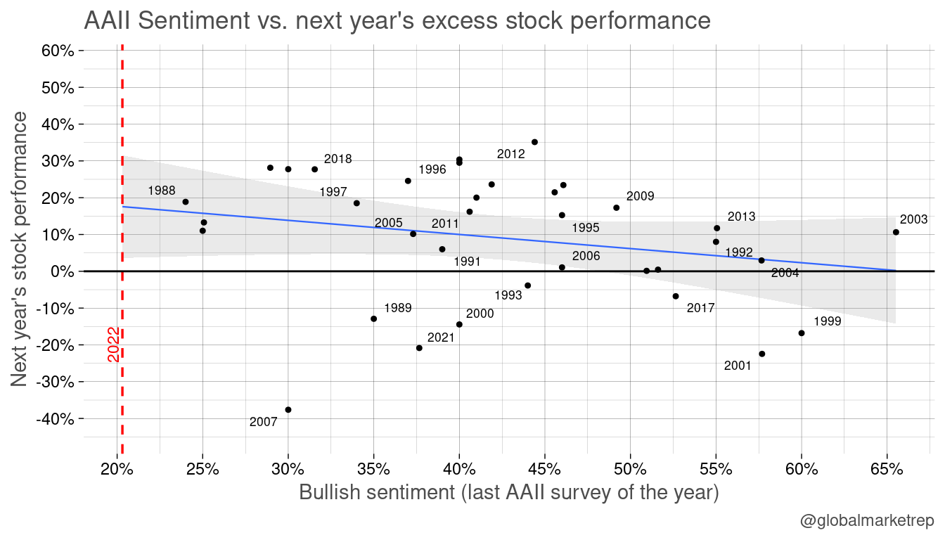
Examples of times where stong bullish sentiment have been followed by poor returns in the stocks include the periods of “irrational exuberance” in 1999, 2001, and 2006. On the other hand, there have also been instances where bearish sentiment prevailed, yet strong returns followed (1988 and 2015).
Based on past data, it seems beneficial to take a contrarian approach, which means going against the majority sentiment. With high levels of bearish sentiment as of December 2022, one may expect a bull market may come in 2023.
Macro Indicators
The Composite Leading Indicator (CLI) is a composite economic indicator designed to predict future economic activity. The CLI is composed of a variety of forward-looking economic indicators, including measures of business activity, employment, and consumer confidence. The CLI is published by the Organisation for Economic Co-operation and Development (OECD) and is designed to provide early signals of turning points in economic activity, helping to identify emerging trends and potential shifts in the business cycle. The CLI is closely watched by investors, businesses, and policymakers.
The CLI is a macroeconomic indicator because it provides a broad overview of economic activity at the national or international level, rather than focusing on a specific sector or industry.
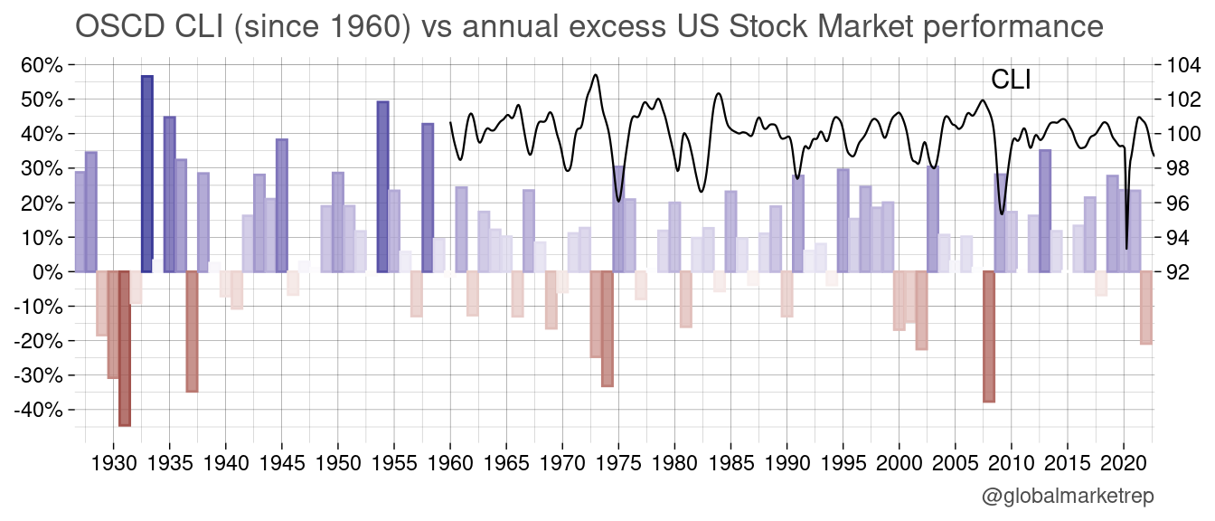
We can observe that when the stock market is performing well, the CLI tends to be high as well. Conversely, when the stock market is performing poorly, the CLI may also be relatively low. The CLI is a concurrent indicator, meaning it provides information about current economic conditions (and not really the future).
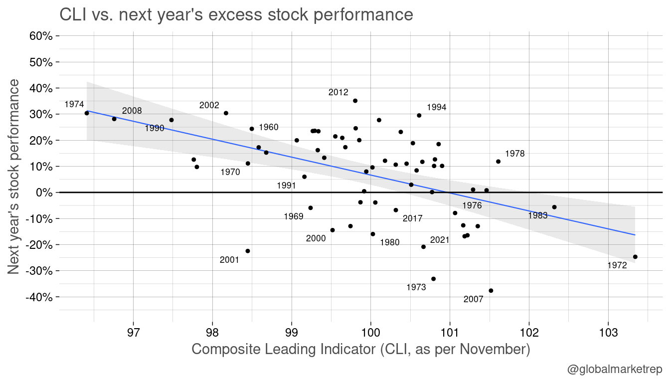
Since 1960, there appears to be a clear relationship between the CLI and future stock market performance. Low levels of the CLI, such as those observed in November 1974, November 2008, or November 2002 (November’s CLI is released in December, so still in the old year), have often been followed by rising stock prices. Conversely, high levels of the CLI, such as those observed in 1972 or 2007, have been followed by falling stock prices.
Put/Call Ratio
There has been some discussion on social media and other media outlets about the Put/Call ratio, which (dependent on the source) as of December 2022 is at an all-time high. This means that more put options are outstanding than call options. This can be interpreted as a sign of increased demand for protection from downside risk. Puts are options contracts that give the holder the right, but not the obligation, to sell a security at a predetermined price within a specific time frame. They can be used by buy-and-hold investors to insure their portfolio against potential losses. The high demand for put options may be seen as a bearish indicator.
Long-term raw data is hard to obtain freely (but available on Bloomberg etc.). The only public source that we could find provides a historical data for the past 10 years (YCharts gives 5 years for free).
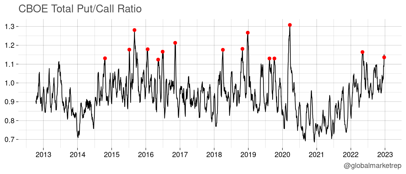
Like the other indicators previously mentioned (sentiment, CLI), a high Put/Call ratio often coincides with increased market uncertainty. In the recent past, this has been observed during times of market turmoil, such as the Covid crash in 2020, Volmageddon in 2018, and the 2015-2016 sell-off. During these periods, the Put/Call ratio reached relatively high levels, suggesting that some investors were seeking protection against potential losses.
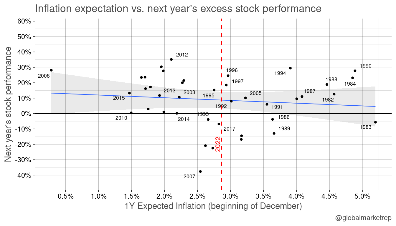
Expected Inflation
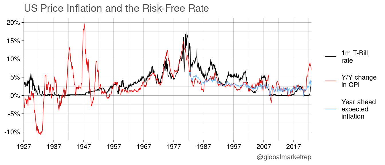
After a long period of stable prices, many people are now (since mid-2021) starting to fear about inflation again. This shift has been driven by a variety of factors, including supply and demand imbalances, increases in the cost of raw materials and labor, and monetary policies that may have contributed to an excess of money in the economy. The prospect of higher inflation has also led to an increase in inflation expectations, as people begin to anticipate that the prices of goods and services will continue to rise in the future. This can have a number of consequences, including reducing the purchasing power of people’s wages and savings, making it more expensive for businesses to borrow money, and increasing the cost of living. While some level of inflation is considered normal and can be beneficial for the economy, excessive or persistent inflation can be harmful and can lead to economic instability. As a result, central banks and governments around the world closely monitor inflation and take steps to address it as needed.
One way that investors can protect their assets during times of inflation is by investing in stocks. Stocks can help investors to maintain or even increase the purchasing power of their assets, because companies tend to increase their prices over time to keep pace with inflation, which can result in capital gains for stockholders. Therefore, there is a general expectation that stocks will rise during times of inflation.
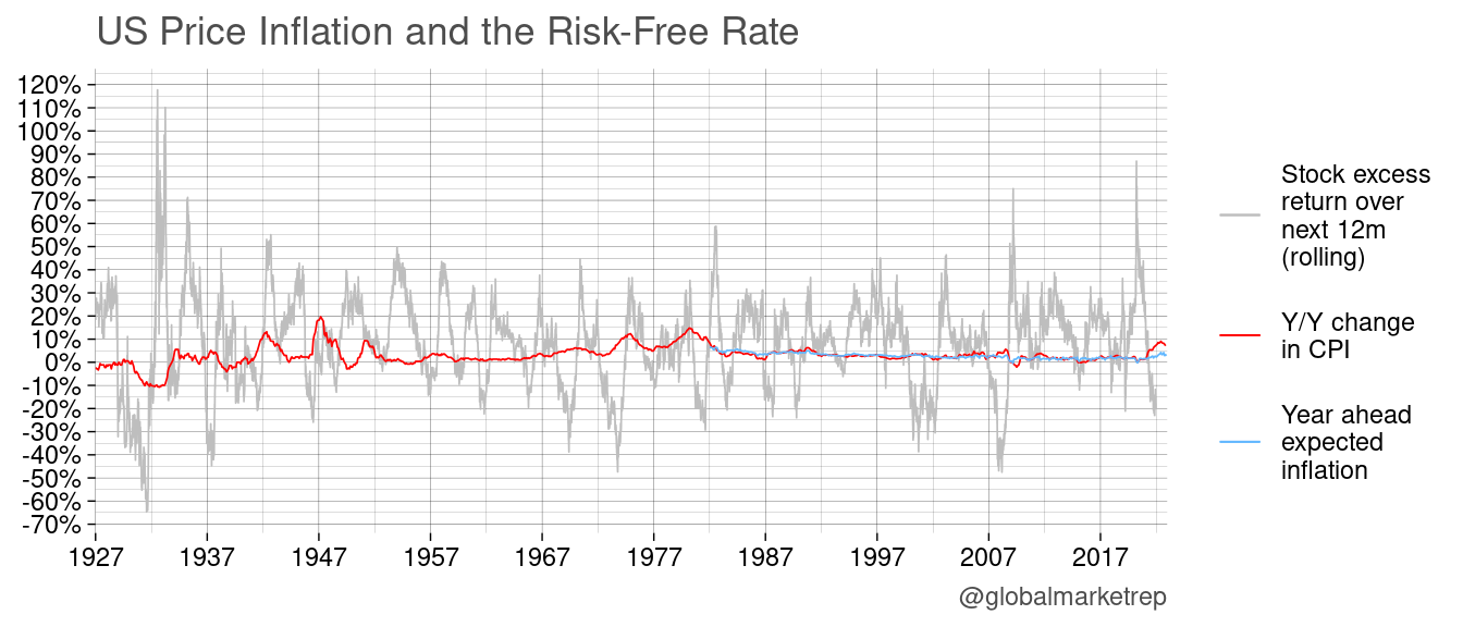
While the relationship between stock prices and inflation may be different over the yet longer run, over a one-year period, it is rare for stock prices to go up after an increase in consumer prices. In fact, many instances of spiking inflation have been followed by crashing markets, such as following 1933, 1949, 1980, and 2021. This may be due to increased uncertainty and the fact that higher inflation can be harmful to the economy.
Yield Curve
The yield curve is a graph that plots the yields of bonds with similar credit quality but different maturities (e.g. US Treasuries with different maturities). It is used to visualize the relationship between yields and the time until the bond matures. A normal yield curve is upward sloping, which means that longer-term bonds tend to have higher yields than shorter-term bonds. This is because investors typically demand a higher interest to compensate for the increased risk associated with holding a bond for a longer period of time. An inverted yield curve, on the other hand, is downward sloping, which means that shorter-term bonds have higher yields than longer-term bonds. An inverted yield curve can be a sign of economic uncertainty or a possible recession.
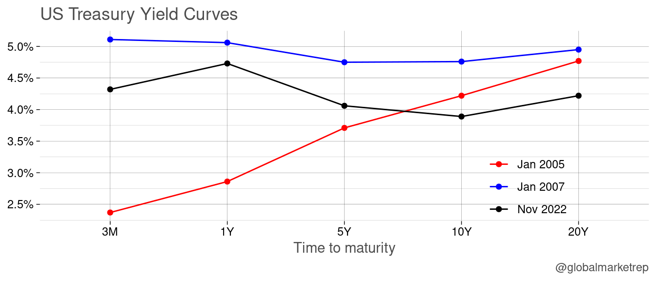
The yield curve can be used as a leading indicator of economic conditions, as changes in the yield differences can often precede changes in the overall economy. For example, an inverted yield curve has often been a precursor to recessions in the past (see curve from January 2007), and as a result, it is closely monitored by investors and policymakers.
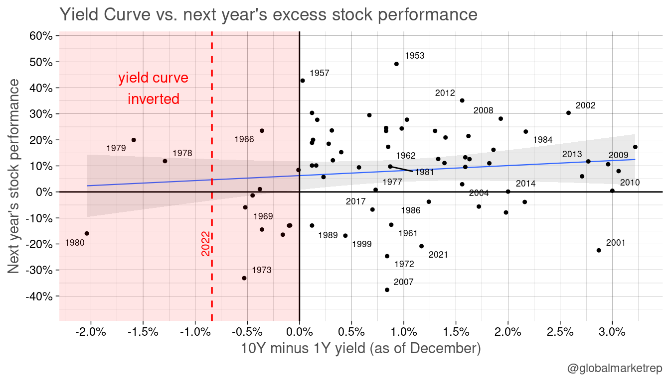
In addition to being an indicator of an upcoming economic downturn, the yield curve can also be used to evaluate the stock market. An inverted yield curve, which is often associated with economic uncertainty and the fear of a recession, can often lead to falling stock prices. Conversely, a normal, upward-sloping yield curve may be seen as a sign that economic conditions are favorable and that stocks may continue to perform well.
While it is impossible to predict anything with certainty, the current inverted yield curve is certainly a development that warrants close attention.
Martin
Trying to make sense of economics and finance. Trading strategies, quant, risk-on/off, macro, global view.